
 by Iris Monica Vargas
During the month of June of the year 1812, at the border between Russia and Poland a group of men begin a singular march. It is the Grande Armée of Napoleon Bonaparte. Their goal is to invade Russia — a task for which 422,000 men have been summoned. It will be a futile effort, however. Utter destruction will come to them during the last months of the year.
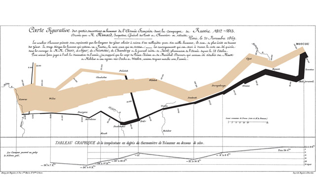
Fifty–seven years later, while in his eighties, a French civil engineer who has enjoyed studying streams and physics, and drawing maps of economic phenomena, will shift his interest to historical subjects. Charles Joseph Minard will depict the soldiers’ travesty in a single map, one that has become irrevocably linked to Bonaparte’s march, and in its own way, just as iconic.
Overlaid on the map of Russia, a brown band represents the diminishing size of Napoleon’s forces as they moved up and down the latitude and longitudes of the vast frozen countryside. The troops had passed the icy Niemen River at a gallop, going from Kovno to Vilna before splitting at Polotzk. By September of 1812 only 100,000 soldiers had reached Moscow. Perhaps in the works of M.M. Thiers and the unpublished diary of Jacob, a pharmacist in the army, Minard absorbed these details, as well as what happened next: With much of Moscow incinerated (historians debate whether the Muscovites deliberately set their own city ablaze, or the fires where accidental), the Czar andthousands of citizens fled the city. A stunned and empty-handed Napoleon was forced into retreat.
On Minard’s map a second path, this one in black, traces this retreat. Running parallel tothe brown band but at only a fraction of its width, the black band makes the Army’s losses all the more poignant. Some 22,000 men never made it across the Berezina River.The cruelty of winter had set in, and a jagged line at the bottom of the graph plots the plummeting temperatures — 20 degrees, –24 degrees, -30 degrees. Of the 422,000 men who marched to Moscow, a thin black wisp stands now for a mere 10,000 men —the only ones who succeeded in returning to their point of departure. History will record it as the onset of the collapse of Napoleon’s Continental Empire.
Minard’s illustration, hailed as one of the best, does what most maps, early and contemporary, do: it visually represents something that is known and valued in the world of the mapmaker. It helps navigate, explore, make sense of, and communicate ideas that might otherwise fade into abstraction, or never materialize at all.
It’s not alone in its intent. A Babylonian cave map made of clay is probably one of the earliest, and simplest, examples. And then there’s the medieval Peutinger, the so-called “quintessential travel map”: a 20-foot x 1-foot scroll depicting the entire Roman Empire, it could be carried by travelers on their voyages. Its jagged lines marked roads and its symbols indicated cities, military camps, rivers, and rocks. These are early examples of the physical geography maps with which so many people are most comfortable.
The science of geography has flourished in an intricate and impactful way in the information age. Currently, more than 20 global positioning system satellites and the reference coordinate system they use (the World Geodetic System) allow for precise calculations of geographic position and navigation. Any person with a laptop connected to the internet, for instance, can search practically any location in the world and immediately learn how to get to it, how long such a trip would take, or even what the location would look like.
But the field of mapmaking has a new challenge far more involved than merely depicting the easily identifiable traits of the physical world. The task at hand is at once ambitious and open-ended — to map the world of scientific knowledge, the collective wisdom that human beings have accumulated and preserved over the past several centuries. This job goes far beyond searching for factoids within scholarly papers and books; it is to navigate these materials in such a way that data — or “noise with a cognitive pattern,” as Spanish philosopher George Santayana once called it — can become information. And if that “information,“ or coherently assembled data, can in turn be related to other information, we will have laid the foundation for knowledge…perhaps even for greater understanding. Minard’s map of Napoleon’s march to Moscow is a good attempt at this construction— a visual rendition more complex than any geographical map past or present. It also conveys hints of what might be possible.
Enter the Science Mapmakers.
Up to 2010 the amount of digital content produced globally is estimated as 1 zettabyte. To put this into perspective, the letter “z“ in a standard Word document amounts to 1 byte. A typewritten page comes to about 2,000 bytes, or 2 kilobytes. A high resolution photograph? 2 million bytes, or megabytes. Add six more zeros and you get two terabytes—the equivalent of all the information contained in the U.S. academic research library (1 terabyte is the equivalent of information printed on paper from 50,000 trees). Another six zeros (we’re now at 18) brings us to the exabyte; five exabytes, according to some scholars, could store all the words ever spoken by human beings. A thousand exabytes equals one zettabyte, the total amount of digital content in the world. Of course, that wasat the outset of 2010: internet traffic alone, as of March 2010, was adding about 21 exabytes each month to the pool. By 2013, internet traffic will likely reach two-thirds of a zetabyte each year—-about 700 exabytes, or approximately the amount of information stored in 7 trillion meters of shelved books. Stacking them up vertically in columns the height of the Empire State Building would produce a little less than a billion stacks of books, of a base the size of a paperback, that would fill roughly half the total land area of New York City.
Just as much of our data, past and present, is linked to science, and judging by the pace at which human beings have produced technological solutions and scientific knowledgeduring the last few decades, a big chunk of these zettabytes, our future data, will also be scientific. Take for example, the new Square Kilometer Array, a massive telescope slated to be built in either South Africa or Australia beginning in 2016. According to the CSIRO, astronomers expect to be processing 10 petabytes of data every hour from this telescope—a flurry of activity that will yield about one exabyte every four days of operation. According to IBM, which is manufacturing hardware especially for the SKA, the new telescope will generate more than one exabyte of data every day. If envisioning all of this data is exhausting, imagine trying to map it.
Yet that is just what some intrepid researchers are trying to do.
Their numbers are small—there are only about 300 science mapmakers in the world—and they are attempting to survey the unimaginable amount of scientific data in existence, convinced that by giving it some shape, structure, or interactive presence, they will be helping to build that critical bridge from data to information to knowledge. And that in so doing, they will be rendering data into a form not only useful in making decisions and determining daily actions, but also within reach of every person on this planet.
Far from mapmakers of 17th century, elderly bearded men in tweeds and gabardines whocloistered themselves in ivory towers, calculating longitudes in rooms filled with dust and maps and mountains of books, the science mapmakers of the twenty-first century are a mix of male and female cartographers, and also of historians, cognition specialists, andscientists schooled in perception, education, data mining, informetrics, webometrics, and more.
Katy Borner, the Victor H. Yngve Professor of Information Science at the School of Library and Information Science at Indiana University, is one of them. She has recently produced The Atlas of Science— a voluminous collection of knowledge that joins samples of science maps with the fascinating turns of history, the events, and the people that led to their making. In the Atlas, we encounter the broad spectrum of ideas that, in one way or another, evolved into this new challenge of mapmaking: the science of representing the known world in a visual way that is accessible to all — a sort of socialism of scientific knowledge.
If the aim of the classical cartographer was to depict the three-dimensional complexity and facts of the “real” world into a two-dimensional page, Borner’s goal, and that of her colleagues is perhaps slightly more daunting. “First, “ says National Geographic Chief Cartographer Allen Caroll, “the world they strive to represent is an abstract and intellectual one, not a physical reality that can be imaged from space, surveyed on the ground, and depicted in miniature on a map. The interrelationships among the landmarks of this abstract world are real, but they are not easily represented in the simple, straightforward ways that one can convey the distances between, say, three cities.”
But just like maps of Earth that have long helped travelers — especially seafaring men and women — take to the oceans, find their land destinations, and return safely to their loved ones, these new maps of science will, ideally, help their users understand where they are on the landscape of science, a very nebulous geography for many given the abstract way that science is often taught in today’s classrooms. “It’s as if scientific disciplines weren’t interconnected,” says Borner. “It’s biology and chemistry and physics and astronomy, and you don’t really know how they all go together. But there are very interesting networks of connections and dynamics among them.”
Those connections have been explored in map form at least twice before. Thirty years ago the Institute for Science Information developed one of the first maps of science. Back then, its makers identified 40 areas of science from a source of 17,000 papers. Although the aim of the developers was to devise a visual image of the structure of science, the outcome, while “intriguing” [according to the researchers who would attempt the feat in 2005], was not sufficiently encompassing. Technologically, it’s safe to say that things have changed since then. Increased computing power and visualization software allowed a team from SciTech Strategies, Inc. to render a map of similar purpose using the superposition of two starting ones: a journal map and a map of scientific papers. The data set comprised about a million papers published in 7,300 unique journals together with their 24.5 million references. First, the journals were placed into 671 clusters. The same was done with the papers, placing more than 730,000 of them into clusters representing research communities.
On the resulting Structure of Science map, developed by SciTech’s Kevin W. Boyack and Richard Klavans, each silver dot over a background of black represents one of 96,500 research communities — each with of an average of nine papers written on a given subject — that were active in science back in 2002. The main fields are depicted in green, pink, yellow, and blue. The product is a colorful universe of dots, like clusters of galaxies, that portrays an image of the various fields and disciplines of science and their interconnectedness. Using this map, researchers and others can search for common patterns, identify emerging trends, and explore relationships across fields ranging from computer science (pink) to infectious disease (maroon) to the humanities (yellow). The UCSD map is currently the most accurate and comprehensive map in existence today, and it will soon be updated to include years 2006 to 2010.
Mapping science can be done in different ways, however. Other reference systems than the ones used for building the Structure of Science map exist. “Maps can be made of different levels. The simplest you could make, for example, would be a map of yourself,” explains Borner. “So if you’d like to understand what your social networks are, what your scholarly network is, you could go to a database for scientists, such as the NIH or NSF,download all data of how you are connected to other people, friends, and colleagues by co-authorship, co-investigator links, spatial closeness, topical closeness, etc. That kind of map is very readable because people immediately know all the people represented in it.”
Other interesting things to map? How about the record of how many times Wikipedia’s entry about “abortion” has been edited since it was first published, including every time it was completely deleted? Done. Or perhaps take a manuscript of a thousand lines and figure out the main characters that drive the story, their relationships and interactions, and the topics covered without actually reading the book, and in such a way that each line of the text forms an arc, stepping clockwise, starting and ending at twelve o’clock in a circular reference system in which words can be placed according to their original occurrence? Maybe even use the same technique to draw a map of the history of science?The first and the latter examples are included in the Atlas of Science, as well as Places and Spaces, an exhibit produced by Borner and her colleagues that, since 2005, has toured in more than 50 national and international venues and has also developed an extensive online gallery.
Whatever the type of map, the idea, says Borner, is to produce what she calls a “global brain,” a name coined by sci-fi author H.G. Wells in his iconic 1939 book, World Brain. “It’s the idea that you would interconnect people around the globe, and empower large numbers of people, rich and poor, to really understand science and technology. You want to give them, she emphasizes, “the data and expertise to trigger certain behavior that is beneficial for the planet and species.
The maps in the Atlas of Science, and science mapping itself, are a visual interface of what we collectively know. And they are meant to be visually stunning. To “deeply engage the minds,” as Borner puts it, you need to stir people not only intellectually but also emotionally.
“Many people understand that it’s bad to drive a big car or to drive instead of bicycling because it puts a lot of waste in our environment, and it uses energy that might be needed for other purposes. However, there are very few people who then say, ‘Alright, I’ll just get a smaller car or sell my car and I will use my bicycle more often.’ I think in order to change people’s behavior, people have to be touched emotionally.”
The cognitive process Borner and colleagues attempt to trigger is one that will be familiar to any artist, writer, or marketing guru. “In some cases you read a sentence and it deeply impacts you all your life,” Borner says. “A quote from a writer sometimes does this to you. And it might also happen that you see a table and you realize, ‘Wow. The number of cancer patients or the number of autistic children in the U.S is increasing.’ ” Visualizations, Borner believes, aren’t “the only thing that can change your behavior or touch your life deeply,” but they make ideas easier to understand and remember.
In fact, Borner envisions something like a Weather Channel for science mapping. “I believe that we should have a national science forecast, Borner says. “We could map science every day, see how it evolves, view the technology that becomes available as a result. We could see what happens with a scientific question over time, or what results from funding a scientific project, for instance.” This type of national science forecast would be a transparent and easy way to access — and assess — what we collectively know, and the kind of products and inventions that we’ve created. The goal, says Borner, is to improve the diffusion of information, displaying not only what works, but especially what doesn’t, reducing time, cost, useless repetition of research, and improvingcontinuity.
A map-based national science forecast certainly sounds alluring. But is there a risk that by generating these maps, we are artificially shaping conclusions that aren’t necessarily real, visualizing trends that aren’t really there, or promoting ones that are there but aren‘t important?
Consider the limitations. Not all reference systems that researchers currently use are freely available. Many of the maps themselves are tucked away in private libraries and computer servers, out of the average person’s reach. Even if maps were universally accessible, making sense of them is another matter. Science maps are not taught in school and hence few people know how to read or use them correctly. Connecting all of these elements — a universal reference system, a common metaphor for data representation, and a standard for picture-science education — remains the coveted grail. “I think we are just in the beginning of our understanding of how to render the structure and dynamics of science for a general audience,” says Borner.
And there are other poignant limitations. For example, most of the science maps in the Atlas are created from data in the English language. “Many people believe that if you just map the papers that have been published in English you get very comprehensive maps. I think we need other languages in there as well,” says Borner. The United States, for instance, could have benefited from the knowledge of water dam constructionaccumulated in the Netherlands. “There’s a rich body of literature on the subject but it’s mostly written in Dutch,” she says. “It would have been very useful to deal with the aftermath or even prevent the effects of Hurricane Katrina in New Orleans. The same is true for other areas of science and technology.” The maps presented in the Atlas, encourage readers to see science from many different angles, using many different reference systems, and many different algorithmic approaches to predicting andforecasting science.
With so many different science mapmakers and approaches to mapmaking, how much objectivity is possible in the creative process?
A recent study by Boyack and Klavans shows that if one takes 20 pioneering large scale maps of science that have been generated over the last hundred years, and reviews the thirteen major areas of science in those maps, the same relations amongst areas emerge. “The structure of science, independent of the data or algorithm used to analyze this data, seems to be relatively stable,” Borner says.
Large-scale maps of science could thus serve as a context for smaller-scale scientific research representations. Like in any other experiment, however, where different people, different types of data and analysis are involved, anybody should be able to replicate your map, large scale or small.
Perhaps one day we can create a base map of science, analogous to a map of our world, upon which different types of data can be overlaid and communicated effectively.
Not long ago Borner and some mapmaking colleagues and researchers presented their science maps to the toughest of all audiences — a classroom filled with curious and demanding nine year olds.
“We first showed them a map of the world and we explained to them where different fields of science developed, and how the areas interlink with each other. We talked about other researchers like Einstein and discussed how many of them had made major contributions and had helped cross-pollinate multiple areas of science,” says Borner. “We asked them to indicate where they might like to work when they grow up, and a little girl said, ‘I want to be a nuclear physicist,’ pointing to the correct area on the map. It was very touching that they had now a guide to find their place in science.”
__________________________
This piece was originally published in SEED Magazine.
